...
Harrington Moving
Brand Identity
Brand Identity
...
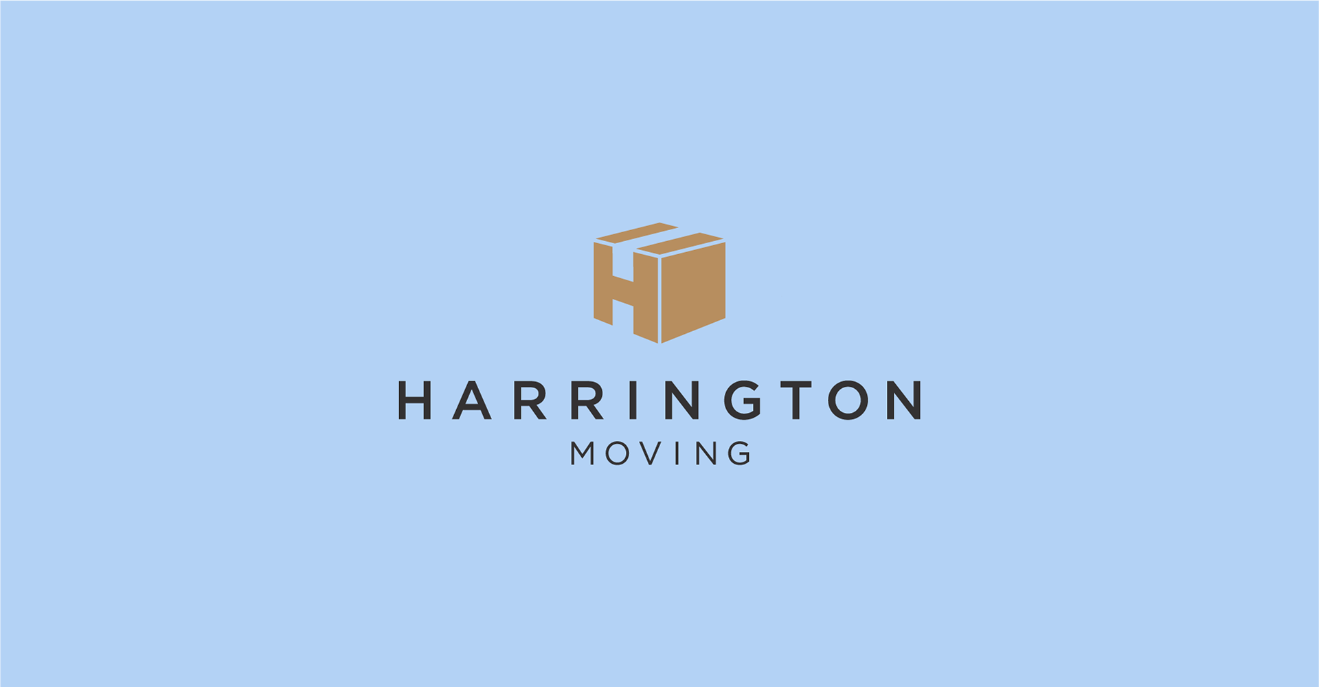
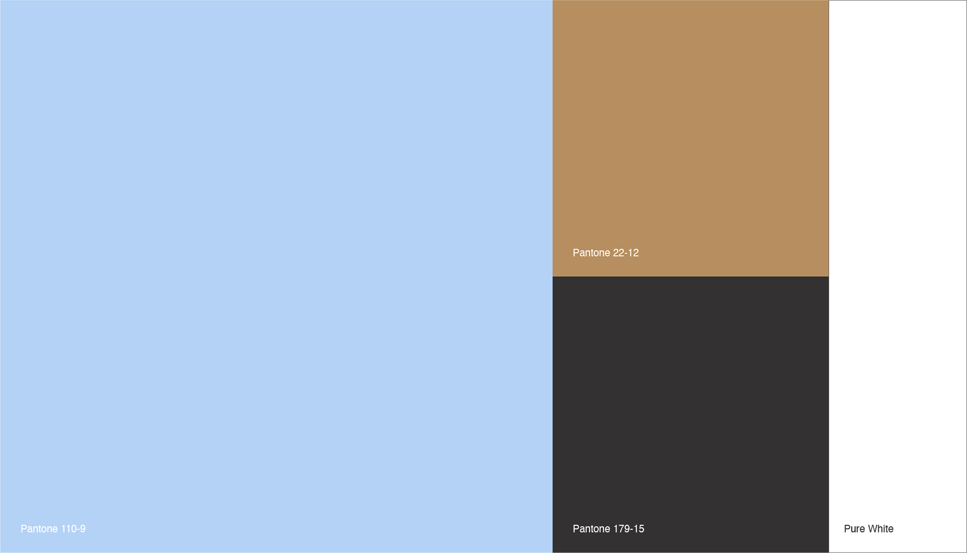
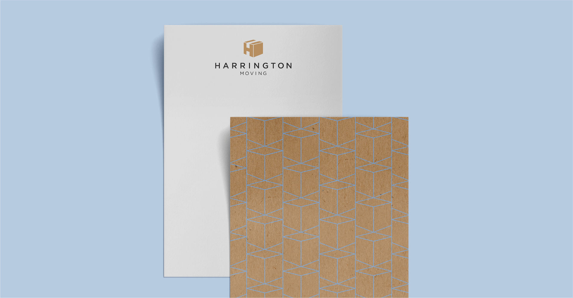
Harrington Moving entered the Cleveland market in 2018 and soon after was in need of a one-of-a-kind, sophisticated logo to represent the company's USP: responsible, polished and trustworthy moving services. The mark for this brand can be viewed as both a cardboard, and as a block-"H." The negative space, running along the top of the mark and peeking up from the bottom, implies the presence of tape sealing the seams of the box, as well as defines the crossbar of the "H" letterform. A line-work variation of the mark transforms into a geometric pattern, engaging the viewer's optical interpretation of foreground and background. The color palette consists of a modern and approachable light blue, a warm black, and "packaging" brown, which is further tied in by the incorporation of craft paper in brand collateral.
Role | Design
Client | Harrington Moving
Client | Harrington Moving